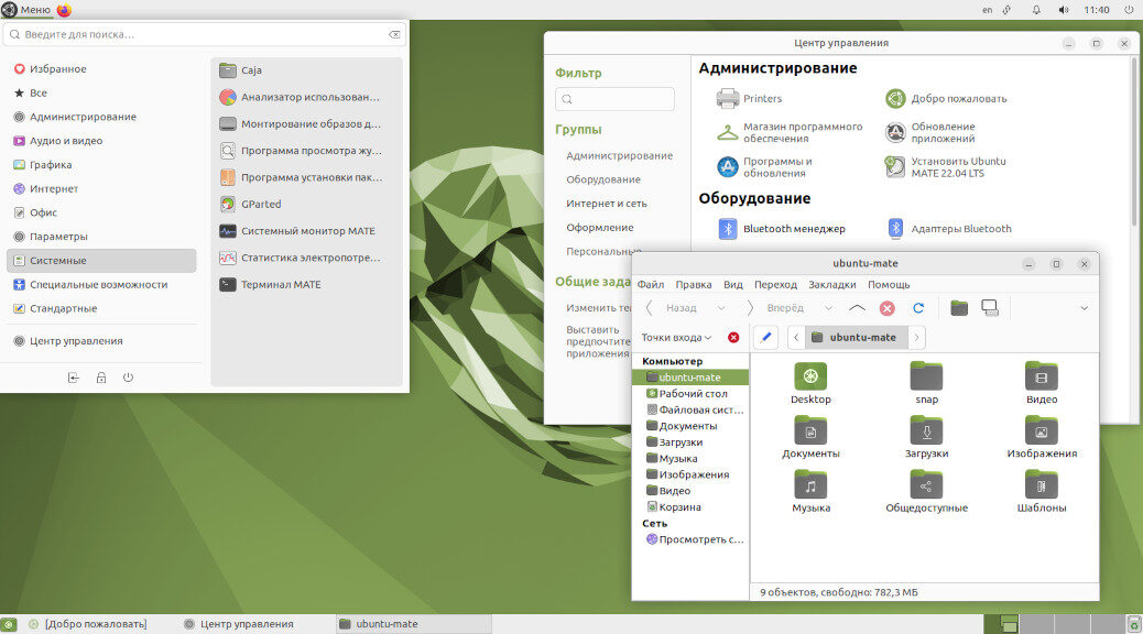
Today I’ll show the default appearance of the Ubuntu distribution with the desktop environment Mate.
🖐️Hey!
Subscribe to our Telegram channel @r4ven_me📱, so you don’t miss new posts on the website 😉. If you have questions or just want to chat about the topic, feel free to join the Raven chat at @r4ven_me_chat🧐.
The Mate desktop is a logical continuation of the Gnome 2 desktop environment, which was released back in 2002. Later, Gnome 2 won the hearts of millions of fans, many of whom still prefer its style to this day. After the release of Gnome version 3, most of these fans were unable to adjust to the radically changed appearance and the heavily cut-down out-of-the-box customization options of their desktop environment’s look.
Modern Gnome 3 !in Ubuntu’s adaptation! can be seen in my previous post What Linux Can Look Like: Ubuntu 20.04. A post with modern, vanilla Gnome 3 will come in the near future.
So, the pictures:
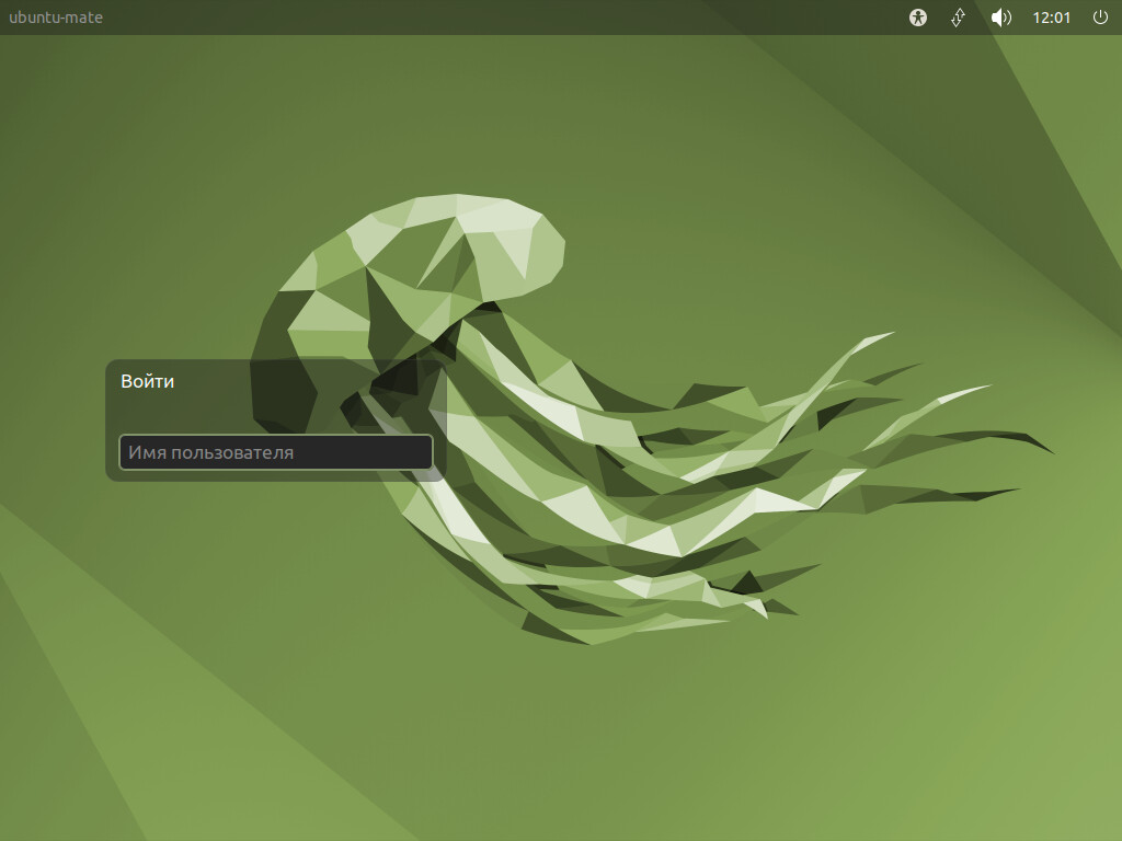
Login screen
By default, Ubuntu MATE has a two-panel layout: the main menu, quick launch icons, and the system tray at the top, and icons of running applications and the virtual desktops widget at the bottom.
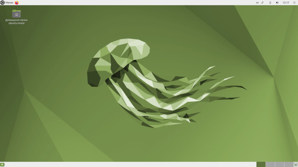
Desktop
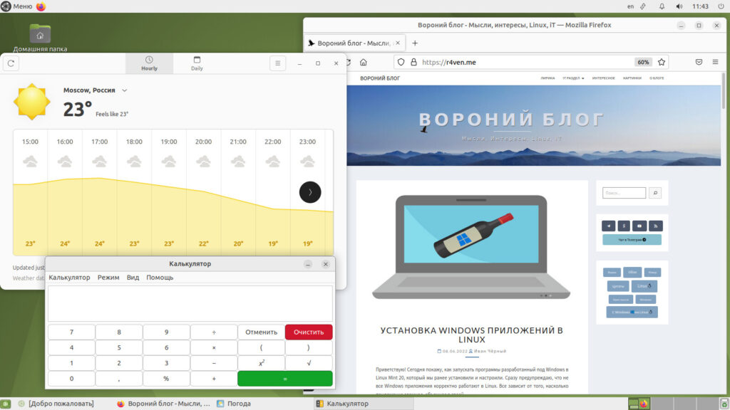
Browser, weather app, and calculator
Of course, a dark theme:
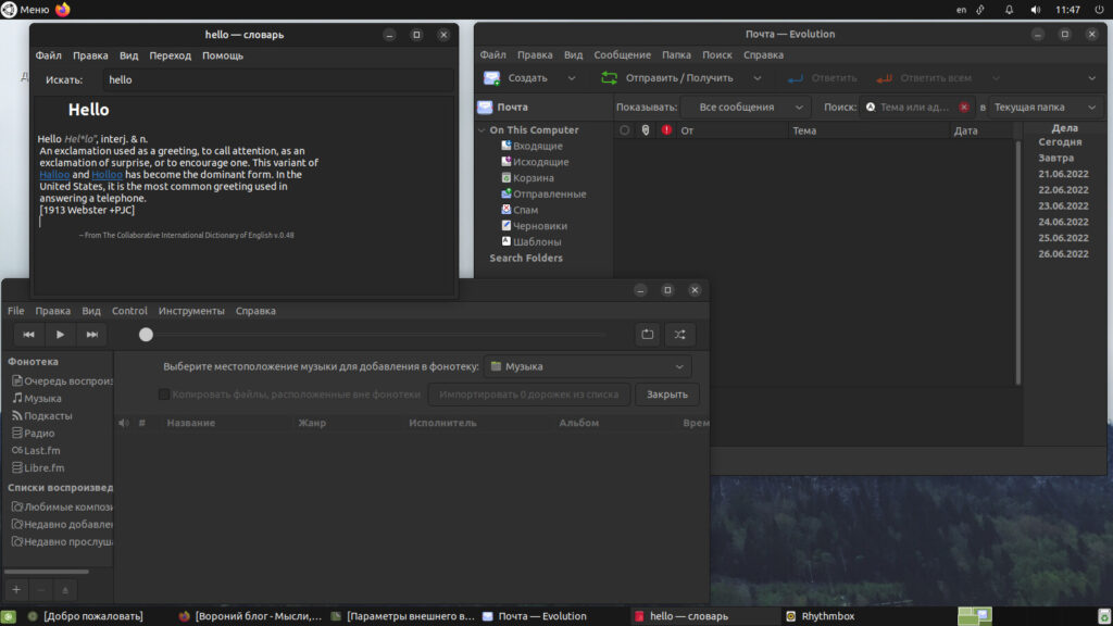
Mail client, dictionary, and audio player
The Ubuntu MATE developers understand their users’ desire to customize their desktop environment, so several ready-made desktop layouts are available out of the box. Here are a few of them.
A Mac OS-style layout with a global menu:

A classic Ubuntu-style layout (unity):

A layout à la Windows XP:
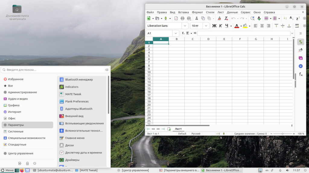
A “Traditional” layout with a minimalistic menu:
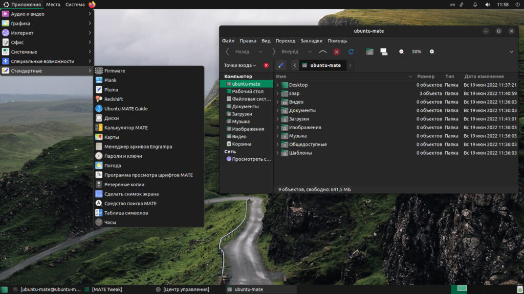
A couple of links:
👨💻And…
Don’t forget about our Telegram channel 📱 and chat
Or maybe you want to become a co-author? Then click here🔗
💬 All the best ✌️
That should be it. If not, check the logs 🙂